Zoom and rescale phase diagrams
In Pandat, the diagrams are plotted from the table data in the workspace, and the data of the diagrams can be obtained through the corresponding table (how to plot a diagram from table data is described in detail on theTable Operation in Pandat page). Here, we will demonstrate how to zoom and rescale to see some parts of the diagram in more detail.
1. Zoom and pan a phase diagram
After you click the zoom icon ![]() in the toolbar, hold down the left mouse button and drag the mouse to select a rectangular area on the graph to enlarge. The graph will zoom in on the selected area when you release the left mouse button. Double-clicking the zoom icon will reset the zoom and display the entire diagram again.
in the toolbar, hold down the left mouse button and drag the mouse to select a rectangular area on the graph to enlarge. The graph will zoom in on the selected area when you release the left mouse button. Double-clicking the zoom icon will reset the zoom and display the entire diagram again.
After you click the pan icon ![]() in the toolbar, the pan mode will be activated. In this mode, you can use the mouse wheel to enlarge or shrink the graph while keeping its center unchanged. You can also hold down the left mouse button and drag the graph to move it. Double-clicking the pan icon will reset the view to show the entire diagram again.
in the toolbar, the pan mode will be activated. In this mode, you can use the mouse wheel to enlarge or shrink the graph while keeping its center unchanged. You can also hold down the left mouse button and drag the graph to move it. Double-clicking the pan icon will reset the view to show the entire diagram again.
2. Rescale diagram axis
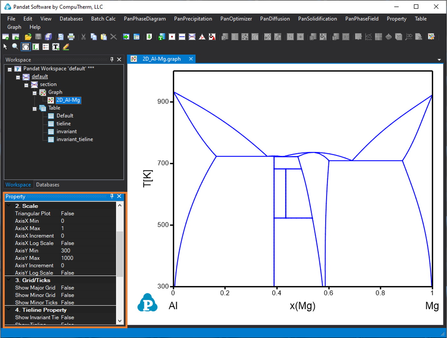
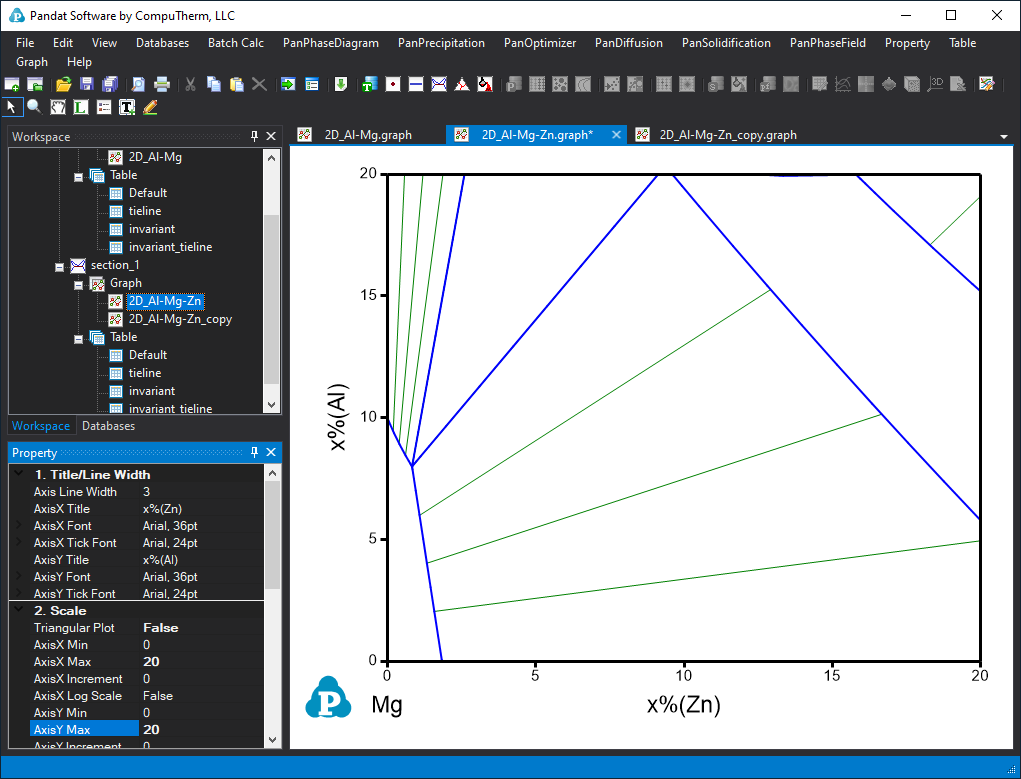
After you open and select a graph, the graph property window will be shown at the bottom left corner. From this diagram property window, you can change your scale by setting the “Axis X min” and “Axis X min”; “Axis Y min” and “Axis Y max” under the group of “2 scale” . You can also change other properties of the diagram, such as Title font and axis Line width; Show grid and ticks etc. Figure 1 shows the graph property window.
3. Rescale a triangle phase diagrams
The procedure to rescale a triangular phase diagram is as follows:
-
Set "Triangular plot" to "False".
-
Rescale the X and Y axes in the Cartesian coordinate system to have the same range.
-
Set "Triangular plot" to "True" again to produce a rescaled triangular phase diagram.
In Pandat, the ternary isotherm sections and liquidus projections are plotted as Gibbs triangle diagrams by default. The default scale is from 0 to 1 (or 0 to 100%). In those diagrams, the “Triangular Plot” is “True”. When the Triangular plot is true, there is no option like “Axis X min”, which means you can not change the axis scale in the triangular manner.
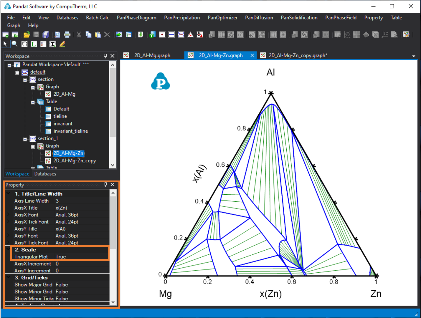
If you want to rescale and only see part of this isothermal section as a triangle diagram. First, you should shift the “Triangular Plot” to “False”. The triangle diagram will change to Cartesian coordinate diagram. Now you can change the minimum and maximum values of the X axis and Y axis. Figure 3 shows the above ternary phase diagram rescaled as 0-20% Zn for X axis and 0-20% Al for Y axis.
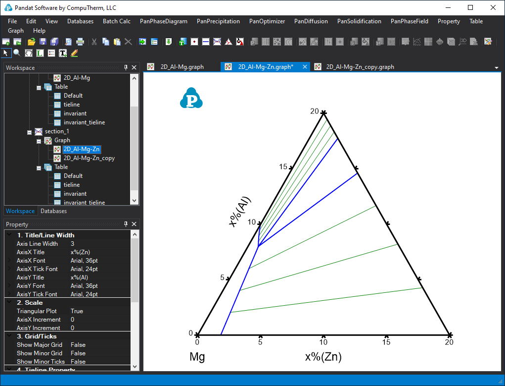
If the X axis and Y axis are set as the same range, then you can change the “Triangular Plot” to “True” again, the rescaled triangle phase diagram is shown as Figure 4.
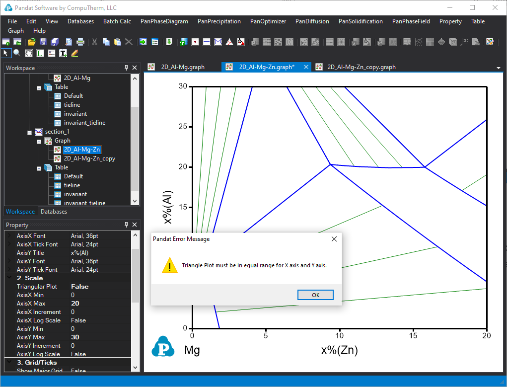
If the X axis and Y axis have different range, a warning message showing as “Triangle Plot must be in equal range for X axis and Y axis” will appear, as shown in Figure 5. (Here we set X axis 0-20% and Y axis as 0-30%).