Graph Operation in Pandat
1. Change color and types of the plotted curves
In PandatTM, the default phase diagram is plotted as blue lines and tie-lines are thin green lines. You can easily change the line color, line thickness and plot types.
Step 1. Click on the curve you want to change properties. If the curve is successfully selected, the selected curve will be highlighted and other curves including the axis boundaries will be gray. In this example, we selected the tie-line.
Step 2. Change the properties in the left side “Plot Property” window, where you can change the “Plot Type” as “Line, Point or LinePoint”. You can also change the “Line Property” and “Marker Property”. Figure 1 shows the tie line of the phase diagram with “line color” changed to “red” and “Line Style” to “Dash“.
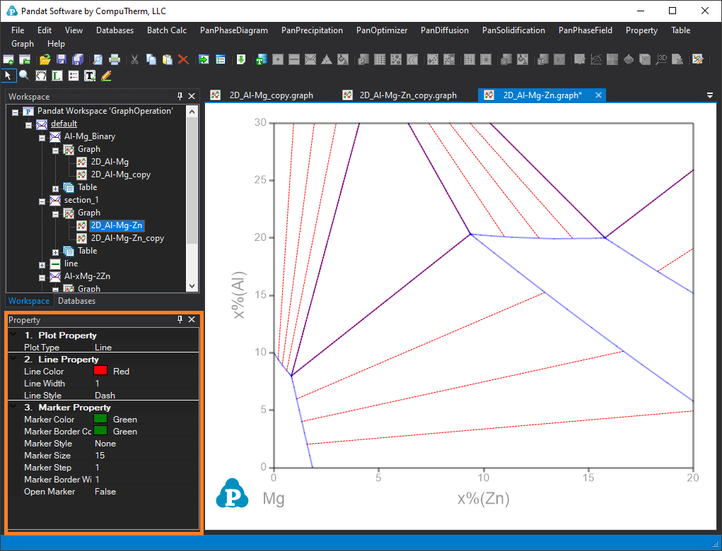
Figure 1. The tie-line of the phase diagram changed into red dash lines
2. Add label, legend, text and draw lines in a graph
Label: After a phase diagram is calculated, the labeling function in PandatTM software will help you to know what are the phases in different phase regions.
Step 1: Labelling phase regions. Click the label icon ![]() in the toolbar, then click the phase region on the phase diagram, the phase name of that phase region will be labeled on the phase diagram.
in the toolbar, then click the phase region on the phase diagram, the phase name of that phase region will be labeled on the phase diagram.
Step 2: Edit the label. Double click on the label, the text editor will appear, then you can also edit the context and properties of the label. For example, you can change the “AlMg_Gamma” used in the database to “γ_AlMg” phase by using the “\g(g)_AlMg” text. The syntax of \g(g) will show the Greek character of g as γ. Figure 2 shows the Al-Mg phase diagram after labeled the liquid and γ-MgAl phase.
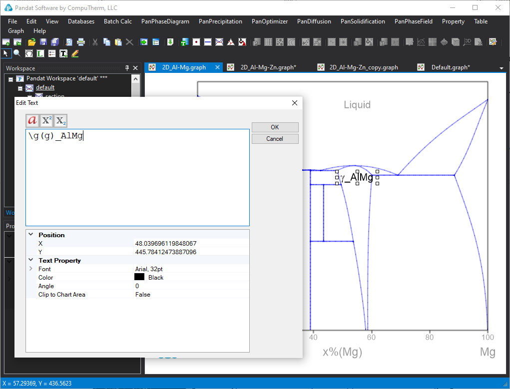
Figure 2. Text editor for labels
Legend: For some properties diagrams, the legend function in PandatTM software will help you to know which are the properties shown in the diagram.
Step 1: Add legend. click the legend icon in the toolbar, then click anywhere on the property diagram, the legend of the curve or data points will be shown on the graph.
Step 2: Edit the legend. Double click on the legend, a legend editor will also be popup, and you can edit the properties of the legends. Figure 3 shows an example of a Mg-Al-Zn alloy line calculation results. The legend shows the color code of different phases.
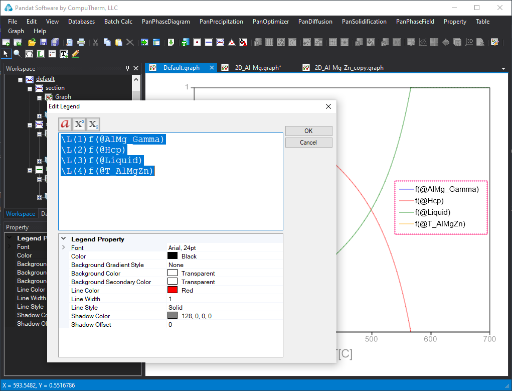
Figure 3. Legend editor
Text: Besides the labeling and legends, you can also add any text on the graph by using the text icon ![]() . After you click the text icon in the toolbar, then click the place you want to add text on the diagram. An “Edit text” box will pop-up, you can type in your text, and also edit the property of the text, including size, color, etc.
. After you click the text icon in the toolbar, then click the place you want to add text on the diagram. An “Edit text” box will pop-up, you can type in your text, and also edit the property of the text, including size, color, etc.
Lines: You can also draw lines on the graph by using the line icon ![]() . The default line has one arrow at end of the line. You can change it through the “End cap” in the “Line Property” window after the line is selected as shown in Figure 4. You can also change other properties of the line such as “line style” and “line width“.
. The default line has one arrow at end of the line. You can change it through the “End cap” in the “Line Property” window after the line is selected as shown in Figure 4. You can also change other properties of the line such as “line style” and “line width“.

Figure 4. Add and edit line properties.