Merge two calculated phase diagrams together
There are three methods to merge two sets of calculated results into one figure for comparison. Here we add the calculated Al-xMg-2Zn ternary phase diagram data on Al-Mg binary phase diagram to compare the effect of Zn in Al-Mg alloys as an example.
Method 1. Using right click “copy data” and “past data”
First, open the phase diagram in Al-xMg-2Zn phase diagram, right click and select “Copy data” as shown in Figure 1. Then, open the phase diagram in “Al-Mg_binary”, right click and select “Paste Data” as shown in Figure 2. The obtained phase diagram is shown as in Figure 3.
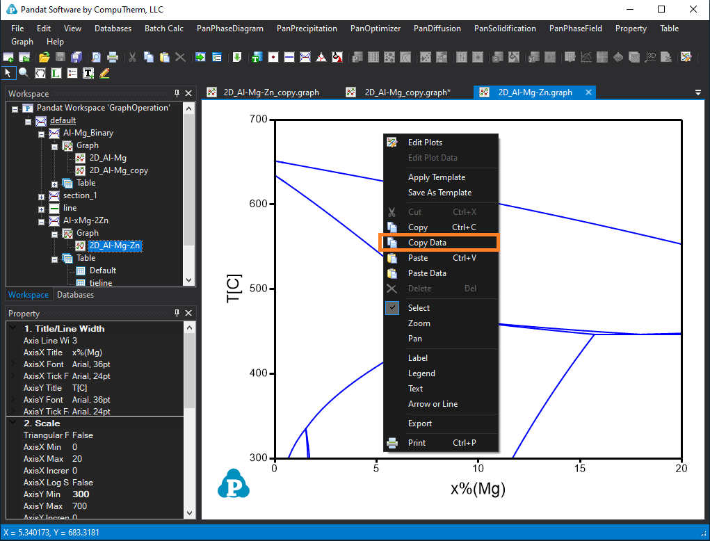
Figure 1. Copy data from Al-xMg-2Zn phase diagram
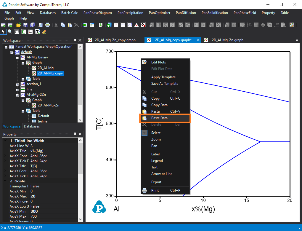
Figure 2. Paste data on Al-Mg phase diagram
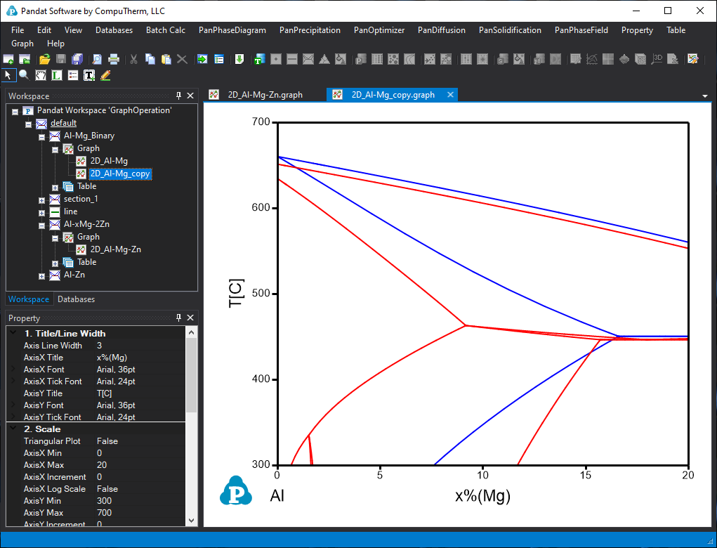
Figure 3. The obtained phase diagram showing the comparison of two calculated phase diagrams
Method 2. Drag and drop from the table data
Step 1. Open the Al-Mg binary phase diagram in the graph window (here is 2D_Al-Mg_copy.graph).
Step 2. Select (single click) the “Default” table in “Al-xMg-2Zn” section. Then the table columns information will be shown in the below “Property” window. First, drag the x(Mg) column and drop on the diagram, then hold the “Ctrl” key, and drag the “T” column and drop on the diagram. The data from the Default table of “Al-xMg-2Zn” section will be added on the Al-Mg phase diagram as shown in Figure 3.
(Note: 1. Single click to select the “default” table of “Al-xMg-2Zn” section, double click on the default table will open this table in the right window. 2. If you drag and drop data from table for a 3D diagram, hold “shift” key to drag and drop the z axis data. )
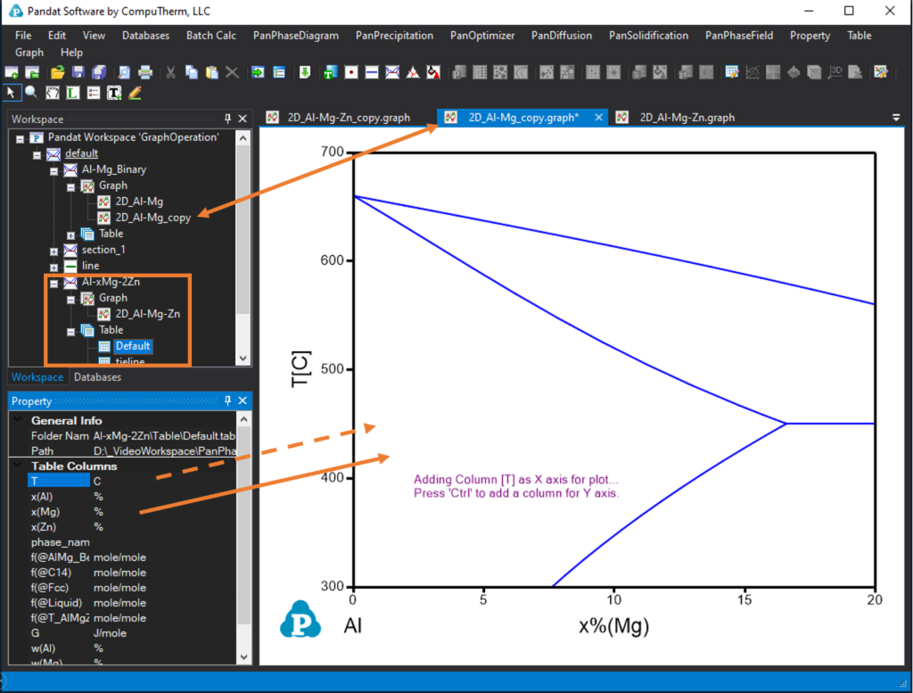
Figure 4. Add Al-xMg-2Zn table data to Al-Mg binary phase diagram. (1) Solid arrow: drag and drop as X-axis data, (2) Dash arrow: drag and drop with the “Ctrl” key held as Y axis data.
Method 3. Use the edit plot icon ![]()
Open the Al-Mg binary phase diagram in the graph window (here is 2D_Al-Mg_copy.graph). Click the “Edit plots” icon ![]() , then a setup plot window will pop up, as shown in Figure 5. Click “Import a Table File”, select the “default” table from “Al-xMg-2Zn” section calculations. The table data will be shown in “available columns”, drag the x(Mg)[%] as X Axis and T[C] as Y axis. Then click OK. The obtained phase diagram will be same as shown in Figure. 3.
, then a setup plot window will pop up, as shown in Figure 5. Click “Import a Table File”, select the “default” table from “Al-xMg-2Zn” section calculations. The table data will be shown in “available columns”, drag the x(Mg)[%] as X Axis and T[C] as Y axis. Then click OK. The obtained phase diagram will be same as shown in Figure. 3.
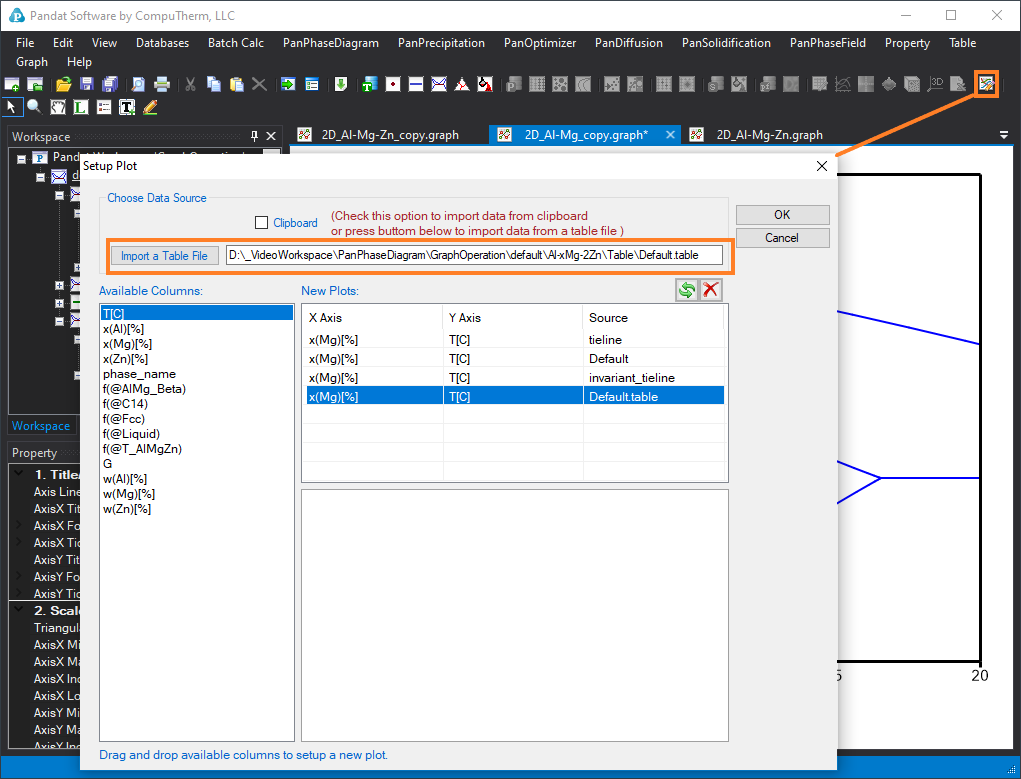
Figure 5. Add data through “setup plot” function using the edit plot icon